

ExactFlow WorkInsight Page User Guide
The WorkInsight page in ExactFlow helps managers, HR teams, and operations leaders clearly understand how work is happening across the organization. It brings together productivity data, activity tracking, attendance, absenteeism insights, predictive analysis, alerts, and unusual activity monitoring in one place.
This page is mainly used to:
Track daily work performance
Understand productivity and activity patterns
Monitor attendance and absenteeism
Predict future attendance risks
Detect unusual or risky work behavior
Improve team efficiency using data
How to Open the WorkInsight Page
Log in to your ExactFlow account.
From the left sidebar menu, click Operational Agent.
Select WorkInsight.
You will now see the WorkInsight page with multiple tabs at the top.
WorkInsight Page Tabs
The WorkInsight page is divided into three main tabs:
-
Dashboard
-
Absenteeism
-
Summary
-
Trends
-
Predictive
-
Alerts
-
-
Unusual Activities
Each tab focuses on a different part of workforce performance and monitoring.
-
Dashboard
The Dashboard provides a complete overview of employee productivity and daily work activity. It is designed to give managers a quick yet detailed view of how teams are performing.
Dashboard Overview
The dashboard includes:
-
Daily performance summary
-
Time and activity tracking
-
Productivity leaderboards
-
Focus and activity analysis
-
App usage insights
-
Alerts and system insights
Filters & Controls
-
Use the calendar option at the top to select a date range.
-
Select Users from the dropdown.
-
All data on the page is updated based on the selected dates & users.
Top Summary Section
At the top of the dashboard, summary cards provide a quick snapshot.
-
Total Hours: Shows the total working hours recorded during the selected period. Helps understand how much time the team spent working.
-
Active Users: Displays how many users were active. Useful to confirm availability and participation.
-
Screenshots: Shows the number of activities or system records captured. Confirms that tracking is active and working correctly.

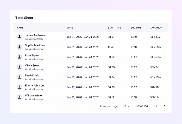
Time Sheet Sectionn
The Time Sheet shows detailed working hours for each user.
-
User name
-
Date
-
Start time
-
End time
-
Total worked duration
How This Helps:
-
Verify working hours
-
Check late logins or overtime
-
Support payroll and compliance checks
Enhanced Productivity Leaderboard
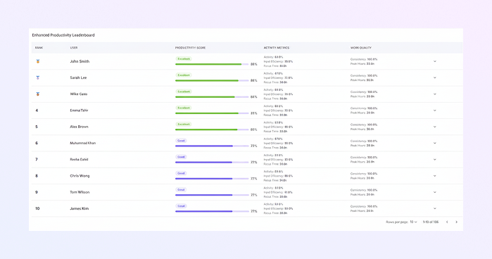
This section ranks users based on productivity.
-
Rank
-
User name
-
Productivity score
-
Activity metrics (keyboard, mouse, system)
-
Work quality
Color Indicators:
At the top of the dashboard, summary cards provide a quick snapshot.
-
Green: High productivity
-
Blue / Purple: Average productivity
Helps recognize top performers and identify users who may need support.
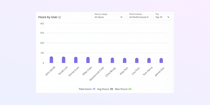
Hours by User
A visual chart showing how many hours each user worked.Useful for balancing workloads and identifying over- or under-utilization.
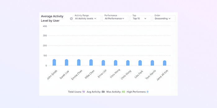
Average Activity Level by User
Shows average activity percentage during logged hours.
-
High activity = focused work
-
Low activity = idle time or distractions
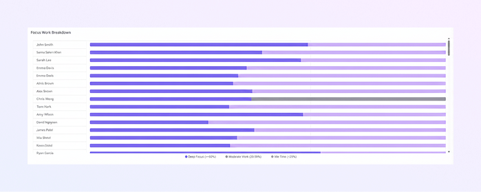
Focus Work Breakdown
Displays how time is split between:
-
Focused work
-
Idle time
-
Neutral or background activity
This makes it easy to understand attention patterns.
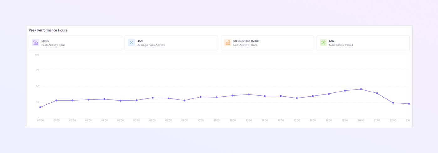
Peak Performance Hours
A line chart showing the hours of the day when productivity is highest.
Helps managers:
-
Schedule meetings wisely
-
Assign important tasks during peak hours
-
Optimize shifts
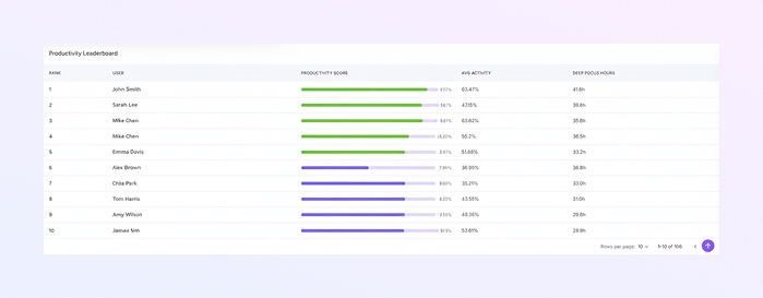
Productivity Leaderboard
The Productivity Leaderboard shows a ranked list of users based on their overall work performance. It helps managers quickly see top performers, compare activity levels, and understand focus time.
-
Rank: Position of the user based on productivity score.
-
User: Name of the employee.
-
Productivity Score: Overall performance score calculated from activity, focus, and work consistency.
-
Avg Activity: Average activity percentage during working hours. Higher values usually indicate active and engaged work.
-
Deep Focus Hours: Total hours spent in focused, uninterrupted work time. This reflects concentration and quality work effort.
How This Table Helps:
-
Identify high-performing employees
-
Compare productivity across the team
-
Recognize strong focus and consistent work habits
-
Support performance reviews and coaching
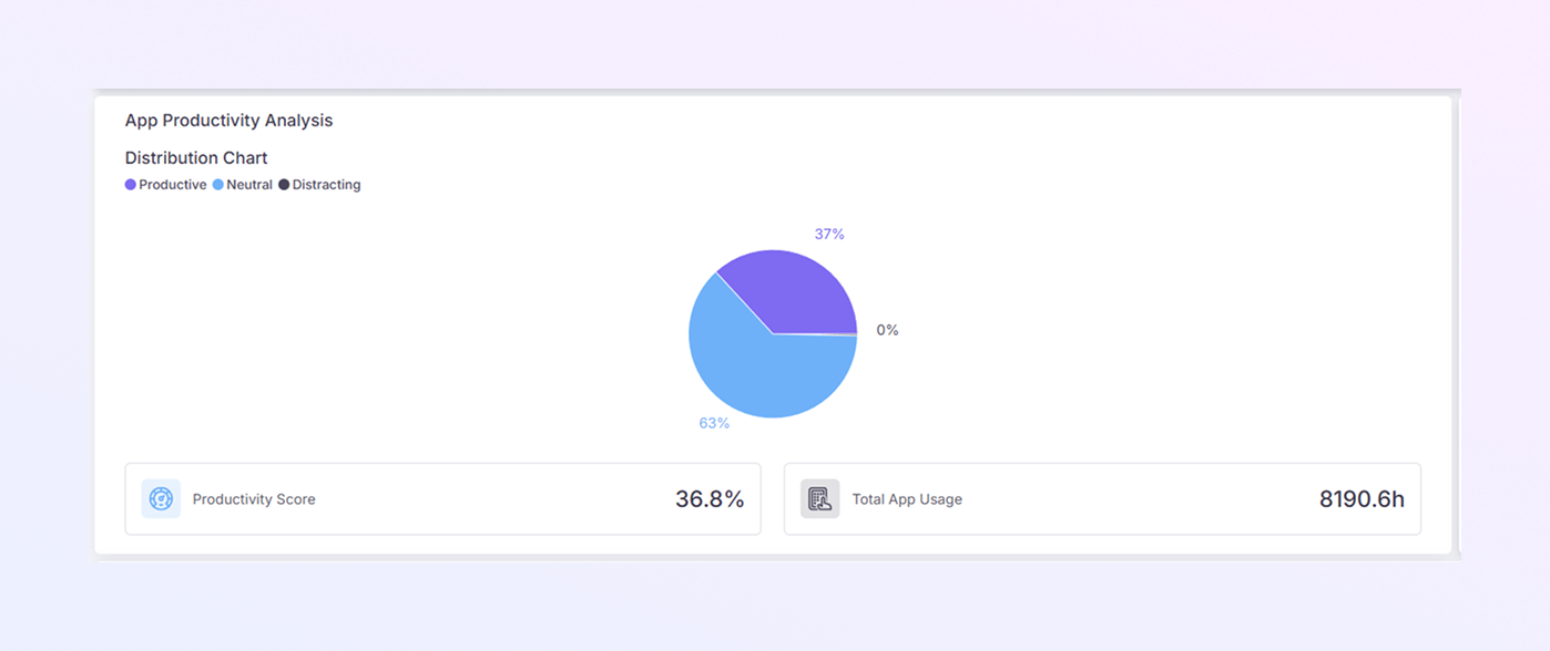
App Productivity Analysis
Shows how work time is spent across applications.
App Categories:
-
Productive apps
-
Neutral apps
-
Distracting apps
Charts display usage percentage, time spent, and productivity impact.
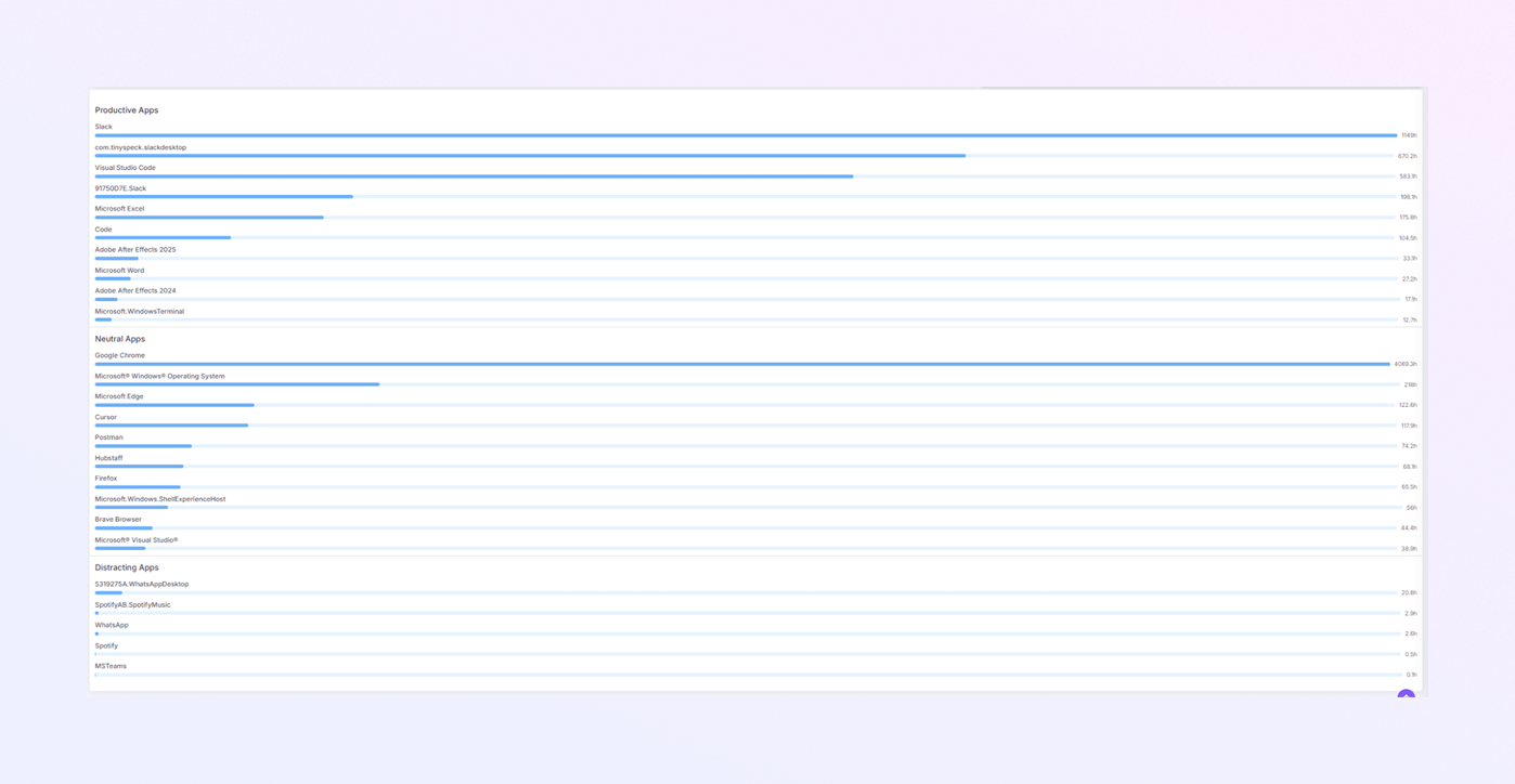
Productive & Distracting Apps Lists
These lists show:
-
Apps contributing positively to work
-
Apps causing distraction
-
Time spent on each app
Managers can guide focus or apply app controls if needed.
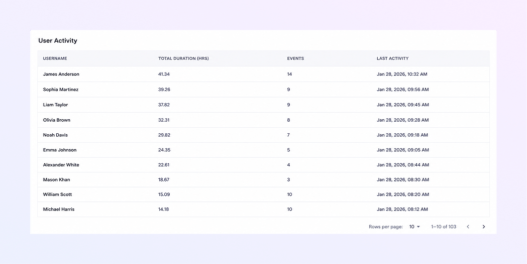
Users Activity Table
Displays:
-
User name
-
Total duration
-
Number of sessions
-
Last activity time
Helps track active and inactive users.
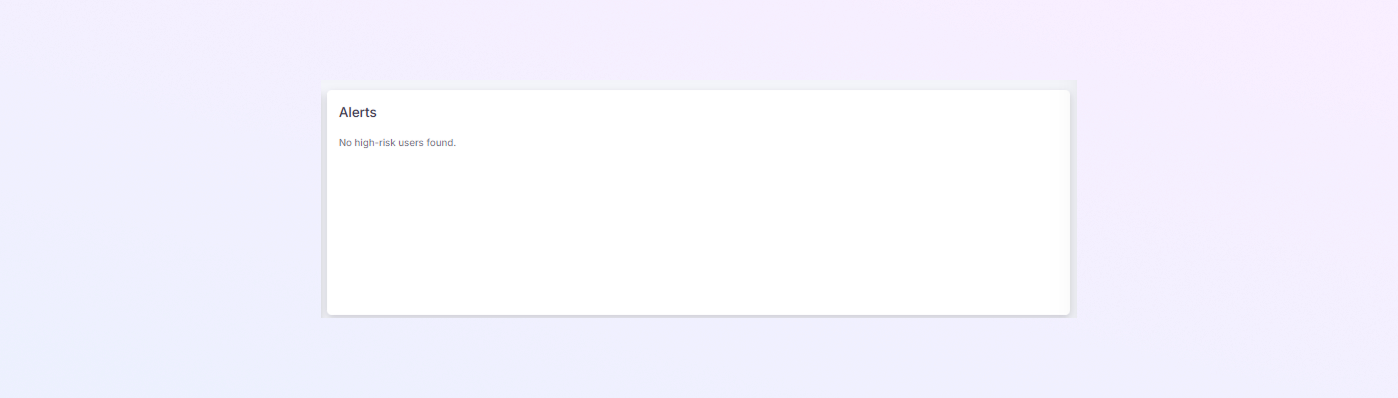
Alerts Section
Notifies managers about:
-
Low productivity
-
Tracking issues
-
Unusual activity patterns
Allows early intervention.
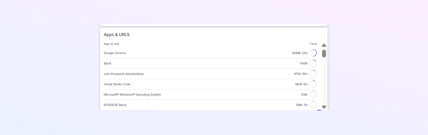
Apps & URLs
The Apps & URLs section shows which applications and websites users spend the most time on during work hours. It helps managers understand where time is being spent and how different tools impact productivity.
-
App or Site: Name of the application or website used (for example, Google Chrome, Slack, Visual Studio Code).
-
Time: Total time spent on each app or site during the selected period.
-
Identify commonly used work tools
-
Understand time distribution across applications
-
Spot heavy usage of communication or development tools
-
Detect apps that may affect productivity
How This Helps:
-
-
Absenteeism
The Absenteeism tab provides full visibility into attendance behavior. It includes summary, trends, predictions, and alerts.
Date Range Selection
-
Use the calendar option at the top to select a date range.
-
All attendance and absence data on the page are updated based on the selected dates.
-
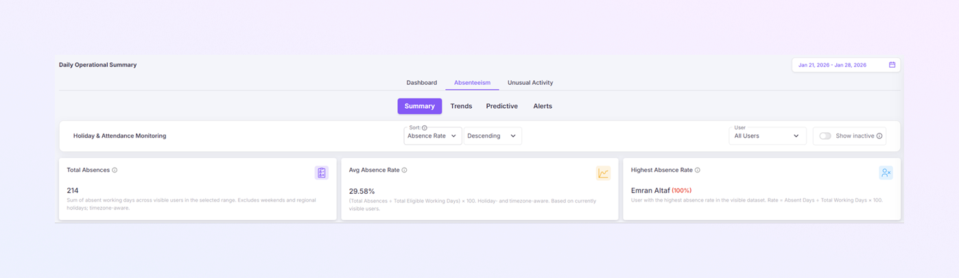
Summary Section
The Summary tab gives a high-level view of attendance and absences.
Holiday & Attendance Monitoring Controls
These options help you sort and filter attendance data easily.
Sort (Dropdown):
You can sort records using the following options:
-
Absence Rate
-
Absent Days
-
Total Days
-
Username
After selecting a sort option, choose:
-
Ascending: Lowest to highest
-
Descending: Highest to lowest
User Filter (Dropdown)
-
Default selection: All Users
-
You can select a specific user to view individual attendance data.
Show Inactive (Toggle)
-
Turn this on to include inactive users in the results.
-
Useful for historical analysis or audits.
Summary Card
-
Total absences: Sum of absent working days across visible users in the selected range. Excludes weekends and regional holidays; timezone-aware.
-
Average absence rate: (Total Absences ÷ Total Eligible Working Days) × 100. Holiday- and timezone-aware. Based on currently visible users.
-
Highest Absence Rate: User with the highest absence rate in the visible dataset. Rate = Absent Days ÷ Total Working Days × 100.
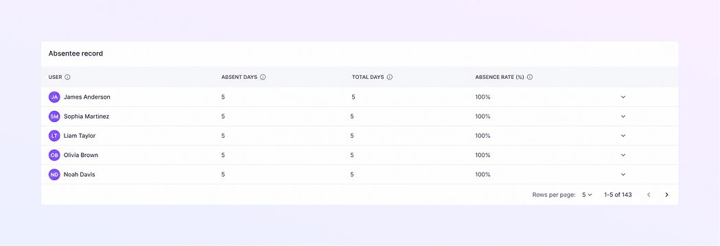
Absence Records Table
Shows:
-
User name
-
Absent days
-
Total working days
-
Absence percentage
Helps review individual attendance history.
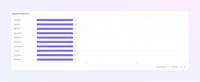
Absence Rate by User
A bar chart comparing absence percentages across users.
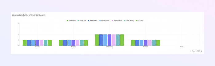
Absence Rate by Day of Week
Shows which weekdays have higher absences. Useful for workforce and shift planning.
-
-
Trends Tab:
The Trends tab shows how absence patterns change over time.
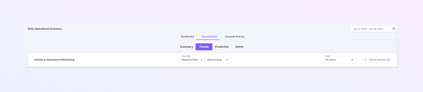
Holiday & Attendance Monitoring Controls
-
Sorting by absence rate
-
Ascending or descending order
-
User filtering
-
Option to show inactive users
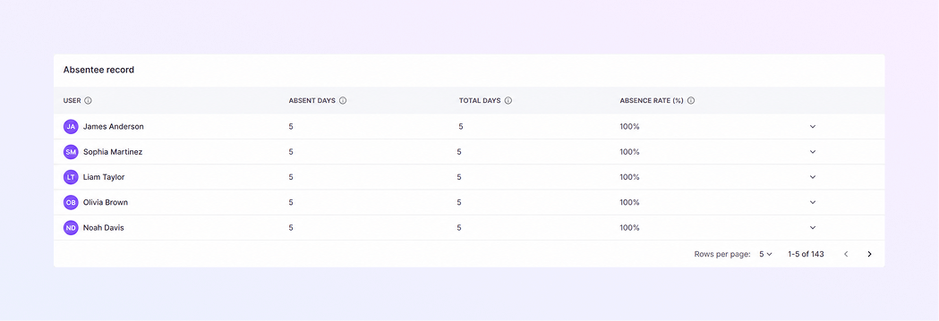
Absentee Record Table
Displays:
-
User
-
Absent days
-
Total days
-
Absence rate (%)
Helps identify frequent absenteeism patterns.
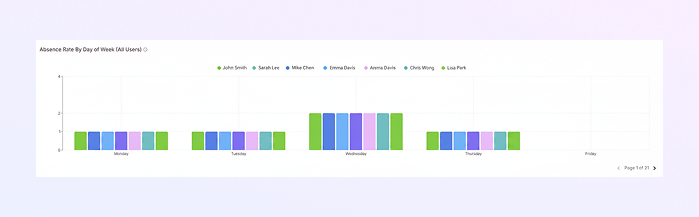
Absence Rate by Day of Week Chart
Shows weekly absence patterns by user. Helps identify problem days and recurring trends.
-
-
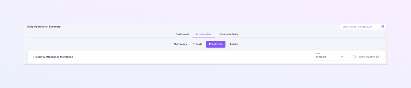
Predictive Tab:
The Predictive tab forecasts future absences using historical data.
Holiday & Attendance Monitoring Controls
-
User filtering
-
Option to show inactive users
Prediction Summary Cards
-
Predicted Absence Rate: Estimated absence percentage for the selected period.
-
Model Confidence: Indicates prediction reliability.
-
High-Risk Users: Number of users likely to have attendance issues.
-
Data Quality: Quality of data used for predictions.

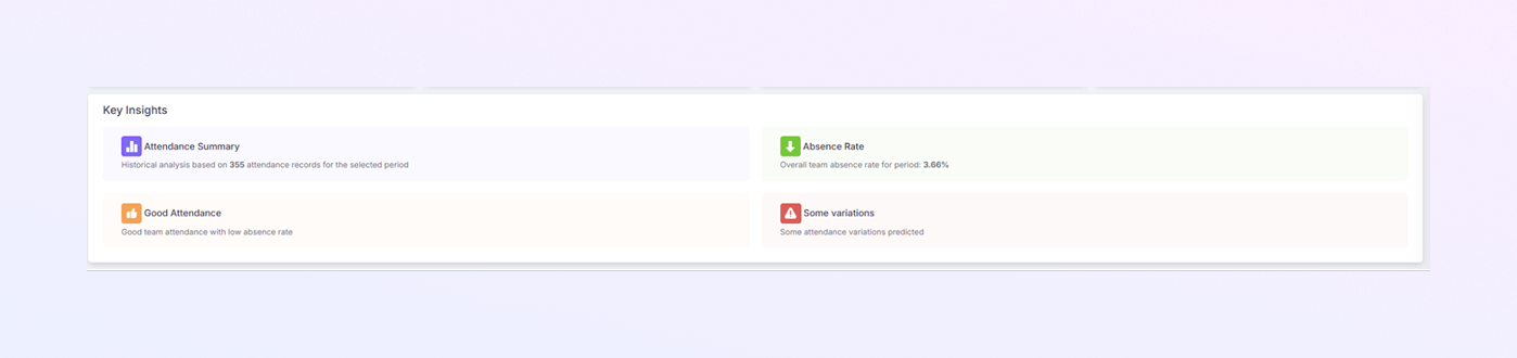
Key Insights
Highlights important attendance observations and expected variations.
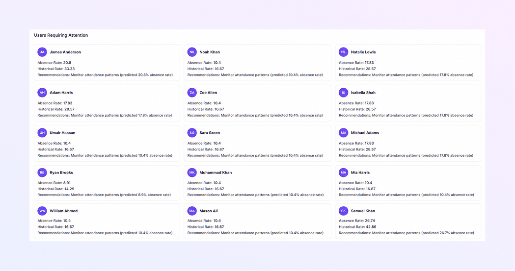
Users Requiring Attention
Lists users with:
-
Predicted absence rate
-
Historical absence rate
-
Recommended actions
Supports proactive management.
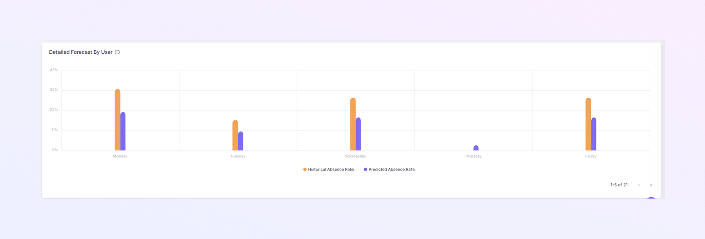
Detailed Forecast by User
Compares historical vs predicted absence rates. Helps plan staffing and workloads.
-
-
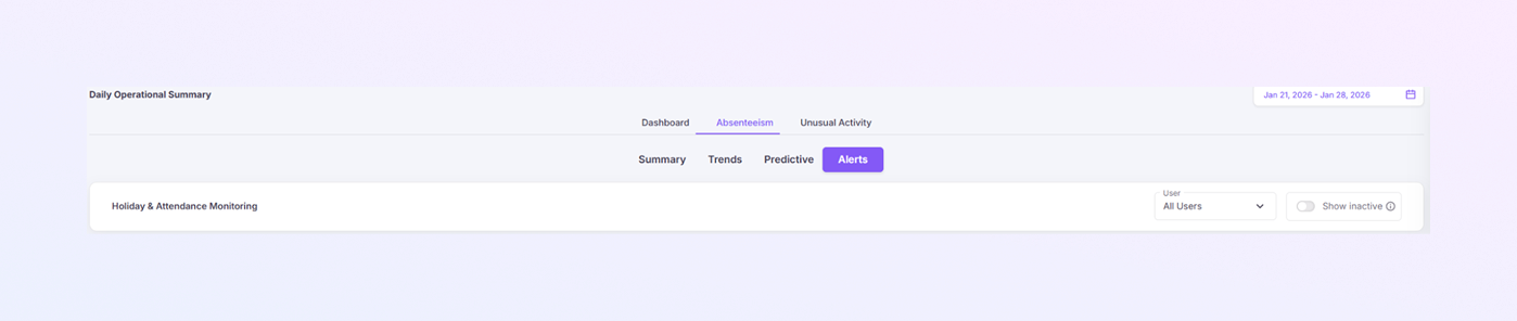
Alerts Tab:
The Alerts tab highlights critical attendance issues that need immediate action.
Holiday & Attendance Monitoring Controls
-
User dropdown (All Users or specific user)
-
Show inactive toggle
Summary Cards
-
Alert Level: Shows severity (e.g., Critical).
-
Users Above Threshold: Number of users exceeding absence limits.
-
Average Absence Rate: Average absence of flagged users.
-
Total Users: Total users included in analysis.

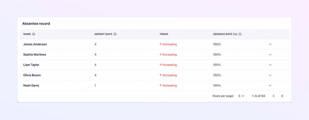
Absentee Record Table
Shows:
-
User name
-
Absent days
-
Trend (e.g., Increasing)
-
Absence rate (%)
Helps prioritize action.
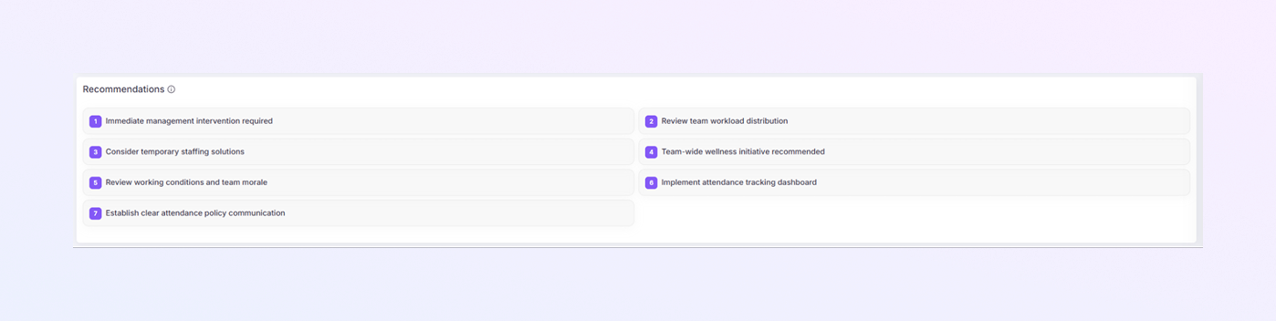
Recommendations Section
Provides actionable guidance such as:
-
Management intervention
-
Workload review
-
Temporary staffing
-
Wellness initiatives
-
Attendance policy improvements
-
-
-
Unusual Activities
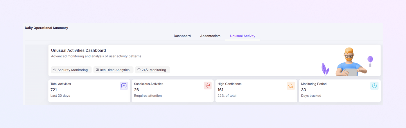
The Unusual Activities tab detects abnormal or risky work behavior. It focuses on security, compliance, and behavior anomalies.
Summary Cards
-
Total Activities: Total unusual events detected.
-
Suspicious Activities: Activities flagged as suspicious.
-
High-Confidence Alerts: Strongly abnormal behavior signals.
-
Monitoring Period: Time range being analyzed.
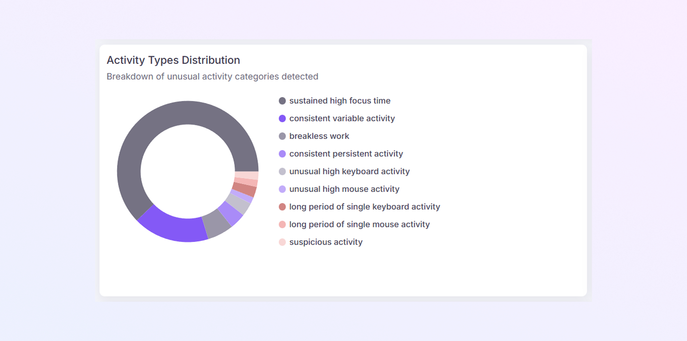
Activity Types Distribution
Shows types of unusual behavior such as:
-
Unusual working hours
-
Continuous activity
-
Inconsistent behavior
-
Suspicious system usage
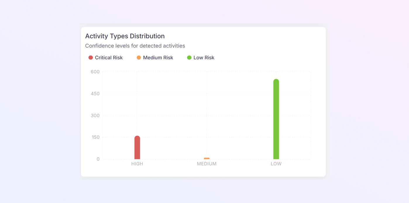
Activity Types Distribution
Group activities into:
-
High risk
-
Medium risk
-
Low risk
Helps prioritize reviews.
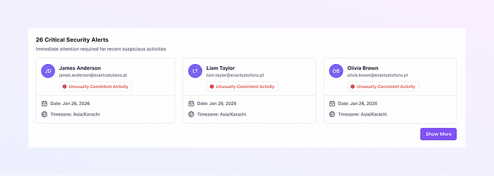
Critical Security Alerts
Lists serious alerts with:
-
User name
-
Activity type
-
Confidence level
-
Date and time
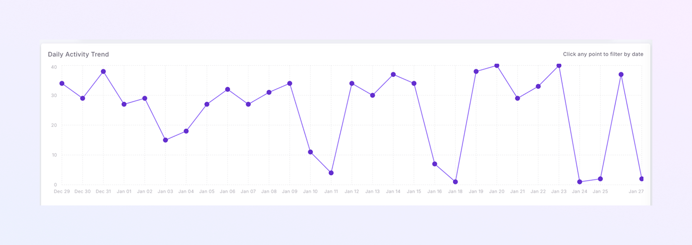
Daily Activity Trend
Shows how unusual activity changes over time.
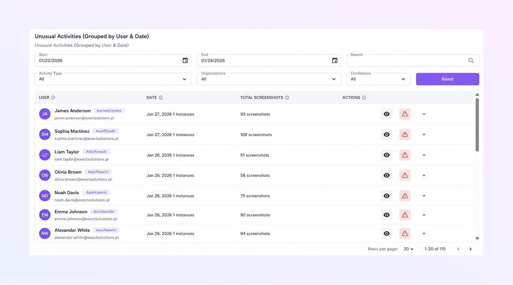
Unusual Activities by User Table
Displays:
-
User
-
Date
-
Activity records or screenshots
-
Review actions
Supports fair, evidence-based decisions.
Filters and Search
Filter by:
-
Date range
-
Activity type
-
Confidence level
-
User name
-
Summary
With the ExactFlow WorkInsight Page, you get:
-
Full productivity visibility
-
Real-time activity tracking
-
App usage insights
-
Attendance and absenteeism control
-
Predictive workforce planning
-
Security and unusual activity monitoring
-
Actionable alerts and recommendations
This page is essential for operations managers, HR teams, and business owners who want clarity, control, and confidence in daily operations.