

ExactFlow Sales Dashboard Page User Guide
The Sales Dashboard in ExactFlow enables you to track sales performance, revenue, orders, and marketplace activity all in one place. It provides a clear overview of how your business is performing during a specified time period.
How to Open the Sales Dashboard
Log in to your ExactFlow account.
From the left sidebar menu, click on Sales Agent.
Click on Dashboard.
You will be taken to the Sales Dashboard page.
Page Overview
The Sales Dashboard is divided into multiple sections that help you understand revenue trends, order status, marketplace performance, and sales volume.
Top Filter Section
At the top of the page, you will see filtering options that control the data shown on the dashboard.
-
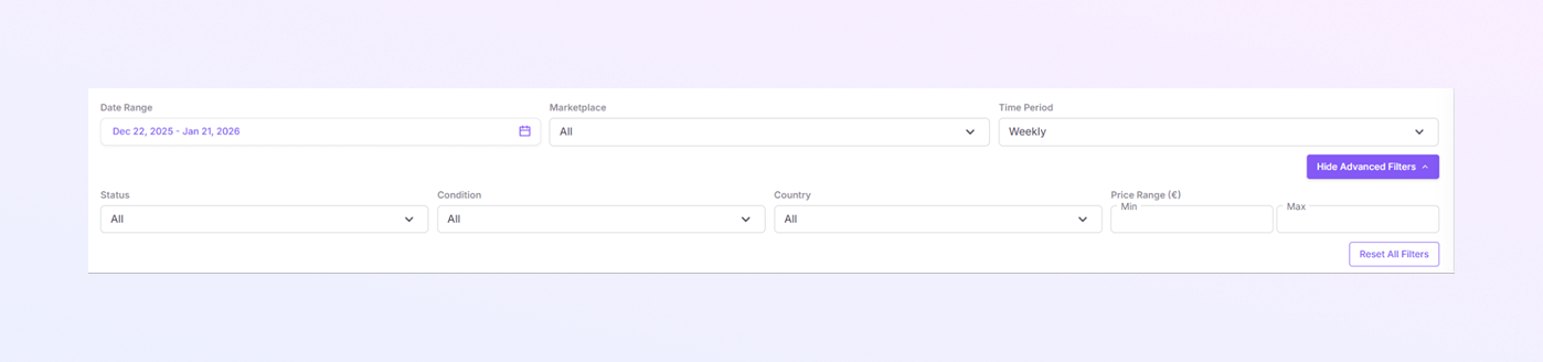
Date Range: Select a start date and an end date to view sales data for a specific period.
-
Marketplace: Choose All to see combined data from all marketplaces. Or select a specific marketplace to view only its data.
-
Time Period: Choose how data is grouped: Daily, Weekly, Monthly.
-
Show Advanced Filters: Click Show Advanced Filters to access more detailed filtering options.
The dashboard updates automatically when you change any filter.
Tabs Section
Below the filters, you will see multiple tabs:
-
Overview
-
Financial
-
Geographic
-
Products
-
Marketplaces
Overview Tab
Key Performance Summary Cards
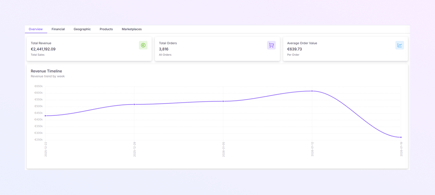
At the top of the Overview tab, three summary cards show important sales metrics.
-
Total Revenue: Displays the total sales revenue for the selected period. This is the combined revenue from all orders and marketplaces.
-
Total Orders: Shows the total number of orders placed during the selected time period.
-
Average Order Value: Shows the average value per order. Calculated as total revenue divided by total orders.
These cards give a quick snapshot of your overall sales performance.
Revenue Timeline
Revenue Timeline Chart
-
A line graph that shows how revenue changes over time.
-
X-axis: Dates (based on the selected time period).
-
Y-axis: Revenue amount.
How to Use It
-
Identify growth trends or drops in revenue.
-
Compare revenue between different weeks or days.
-
Spot sudden spikes or declines in sales.
Marketplace Distribution
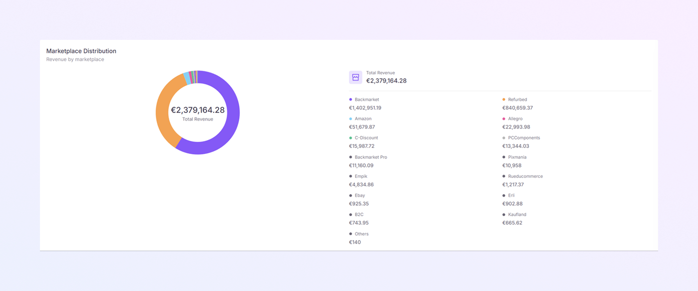
Donut Chart (Revenue by Marketplace)
-
Shows how total revenue is distributed across marketplaces.
-
Each color represents a different marketplace.
Total Revenue (Center of Chart)
-
Displays the total revenue for the selected period.
Marketplace List (Right Side)
For each marketplace, you can see:
-
Marketplace name
-
Revenue amount generated
This section helps you understand which marketplaces generate the most revenue.
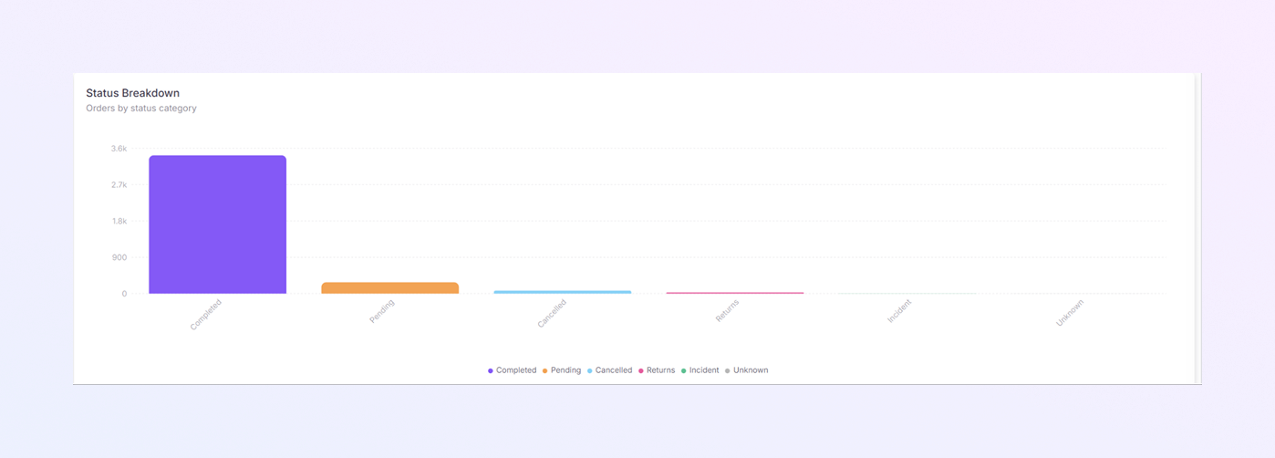
Status Breakdown
Orders by Status Chart
-
A bar chart showing the number of orders by status.
Order Status Types
-
Completed: Orders that are successfully finished.
-
Pending: Orders still being processed.
-
Cancelled: Orders that were cancelled.
-
Returns: Orders returned by customers.
-
Unknown: Orders with unclear status.
-
Incident: Orders with issues or problems.
How to Use It
-
Quickly check how many orders are completed, pending, or cancelled.
-
Identify potential issues with returns or incidents.
Marketplace Revenue Comparison
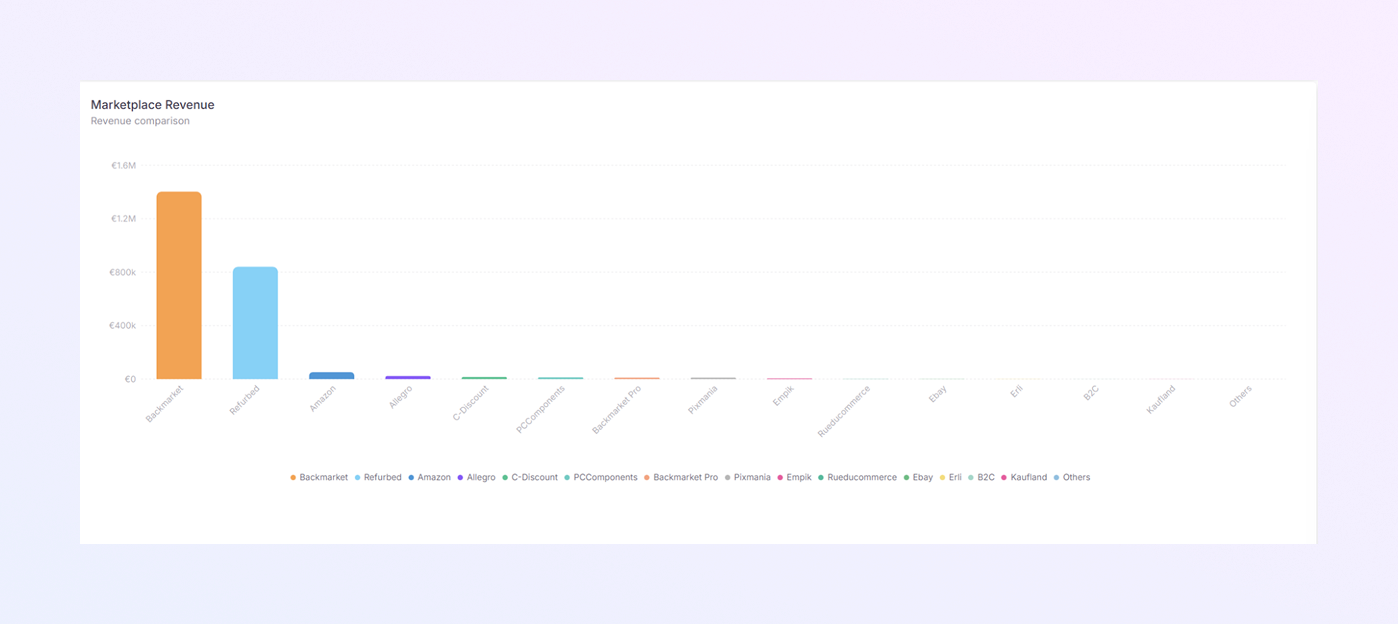
Marketplace Revenue Bar Chart
-
Compares revenue across different marketplaces.
-
Each bar represents one marketplace.
-
Taller bars mean higher revenue.
How to Use It
-
Easily compare performance between marketplaces.
-
Identify top-performing and low-performing channels.
-
Support decisions about where to focus sales efforts.
Sales Volume Trend
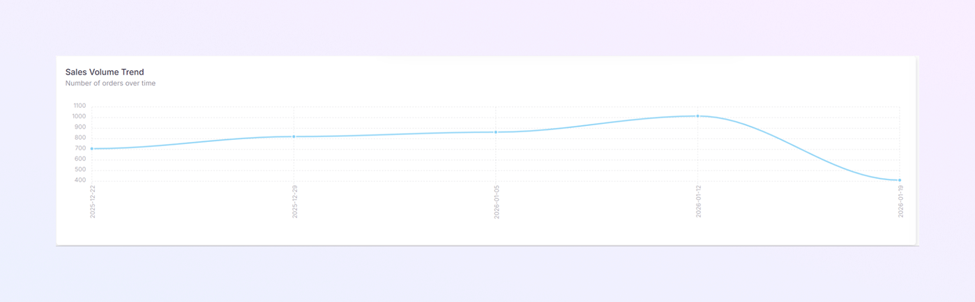
Sales Volume Trend Chart
-
A line chart showing the number of orders over time.
-
X-axis: Dates
-
Y-axis: Number of orders
How to Use It
-
Track order volume growth or decline.
-
Identify high-sales periods.
-
Compare order trends with revenue trends.
Financial Tab
It helps you understand your financial performance in detail. It shows revenue structure, refunds, commissions, and profit margins so you can clearly see where your money comes from and where it goes.
The Financial tab is divided into four main sections:
-
Revenue Breakdown
-
Refund Analysis
-
Commission Comparison
-
Margin Trends
Each section gives you insight into a different part of your financial performance.
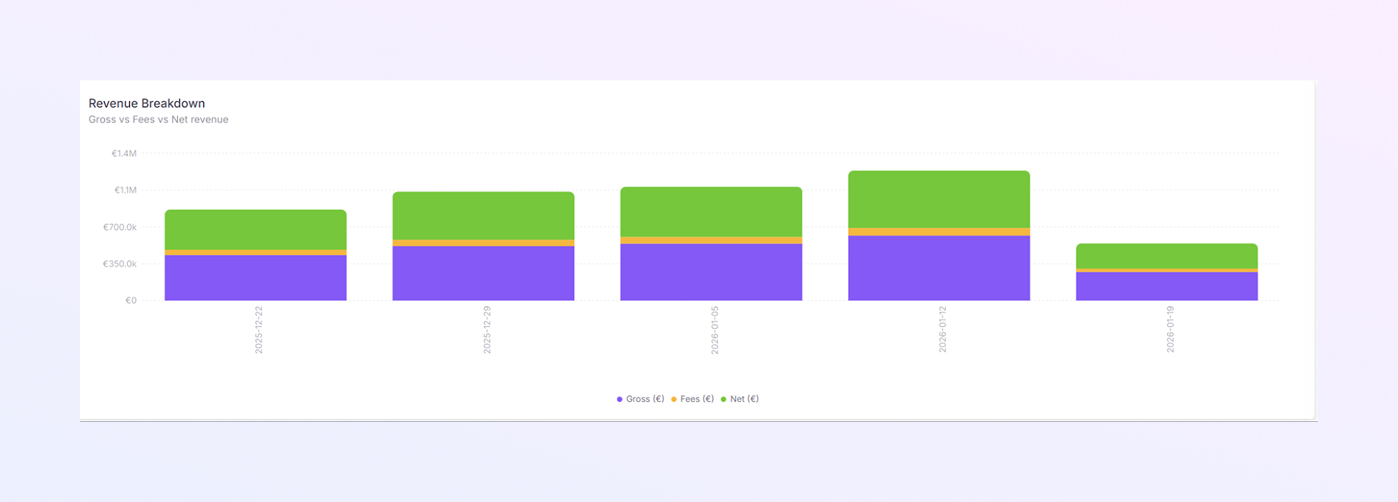
Revenue Breakdown
-
This bar chart explains how your revenue is split into:
-
Gross Revenue: Total sales before any deductions
-
Fees: Marketplace or platform fees
-
Net Revenue: Revenue after fees are deducted
-
-
Each bar represents a time period (day, week, or month)
-
Each color represents a revenue type:
-
One color for Gross
-
One color for Fees
-
One color for Net
-
-
Taller bars mean higher revenue.
How to Use It
-
Understand how much you actually earn after fees.
-
Compare revenue structure over time.
-
Identify periods with higher fees or lower net revenue.
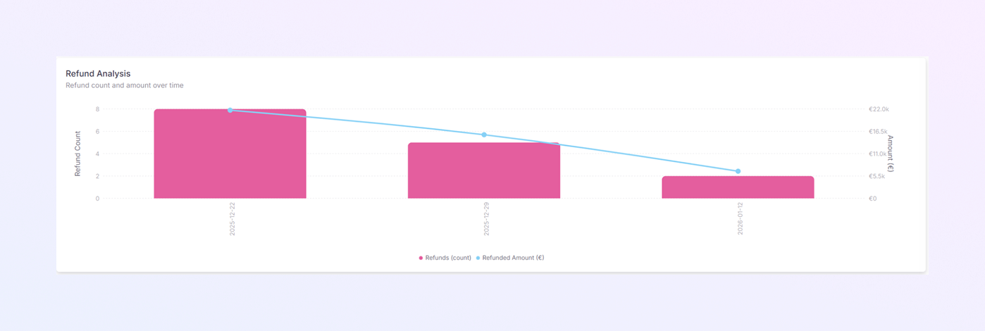
Refund Analysis
-
This section tracks refunds over time and includes:
-
Refund Count: Number of refunded orders
-
Refund Amount (€): Total value of refunded money
-
-
Bar chart for refund count & Line graph for the refunded amount.
-
Bars show how many refunds occurred in each time period.
-
The line shows the total refunded amount in euros.
How to Use It
-
Identify spikes in refunds.
-
Monitor how refunds affect revenue.
-
Investigate periods with unusually high refund values.
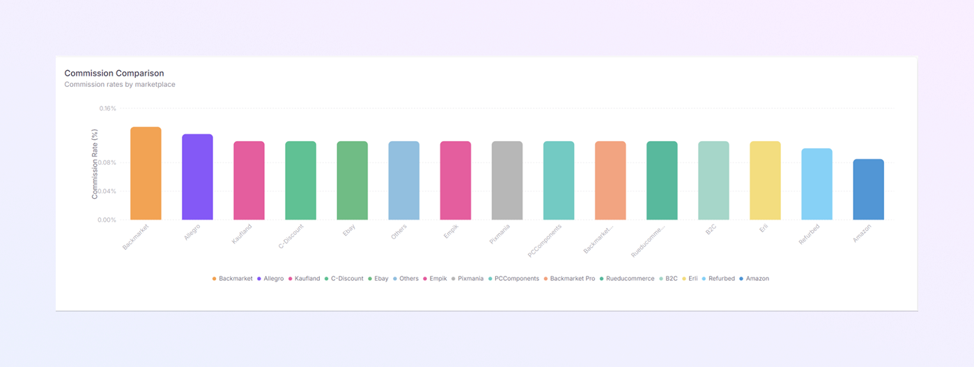
Commission Comparison
-
This Vertical bar chart compares commission rates across marketplaces.
-
Each bar represents one marketplace.
-
Higher bars mean higher commission rates.
-
Different colors represent different marketplaces.
How to Use It
-
Understand which marketplaces charge higher commissions.
-
Compare cost efficiency between sales channels.
-
Use this data when planning pricing or marketplace strategy.
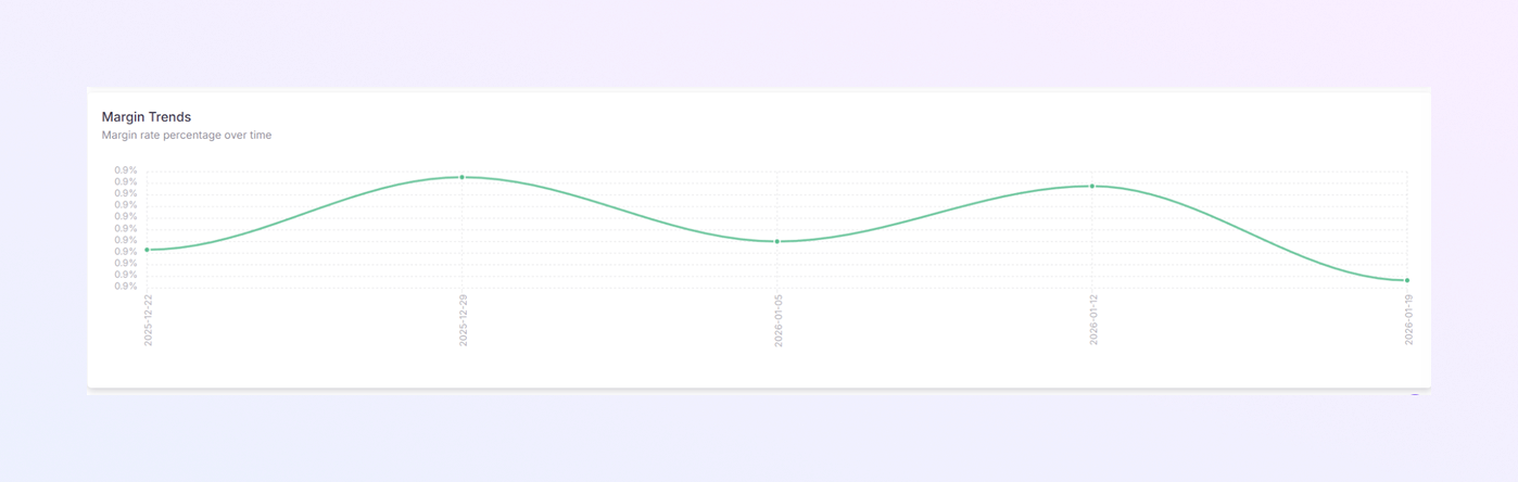
Margin Trends
-
This line chart displays your profit margin percentage over time.
-
X-axis: Time period
-
Y-axis: Margin percentage (%)
-
-
An upward line means improving margins.
-
A downward line means declining profitability.
How to Use It
-
Track long-term profitability trends.
-
Identify periods of strong or weak margins.
-
Connect margin changes with refunds, fees, or commission changes.
Geographic Tab
This tab helps you understand where your sales come from. It shows revenue and orders by country and city, so you can see which regions perform best. This tab is very useful for planning regional sales strategies, logistics, and market expansion.
The Geographic tab is divided into three main sections:
-
Geographic Distribution (Top Section)
-
Top Countries & Top Cities (Middle Section)
-
Country-Wise KPI Table (Bottom Section)
Each section gives you clear insights into sales performance by location.
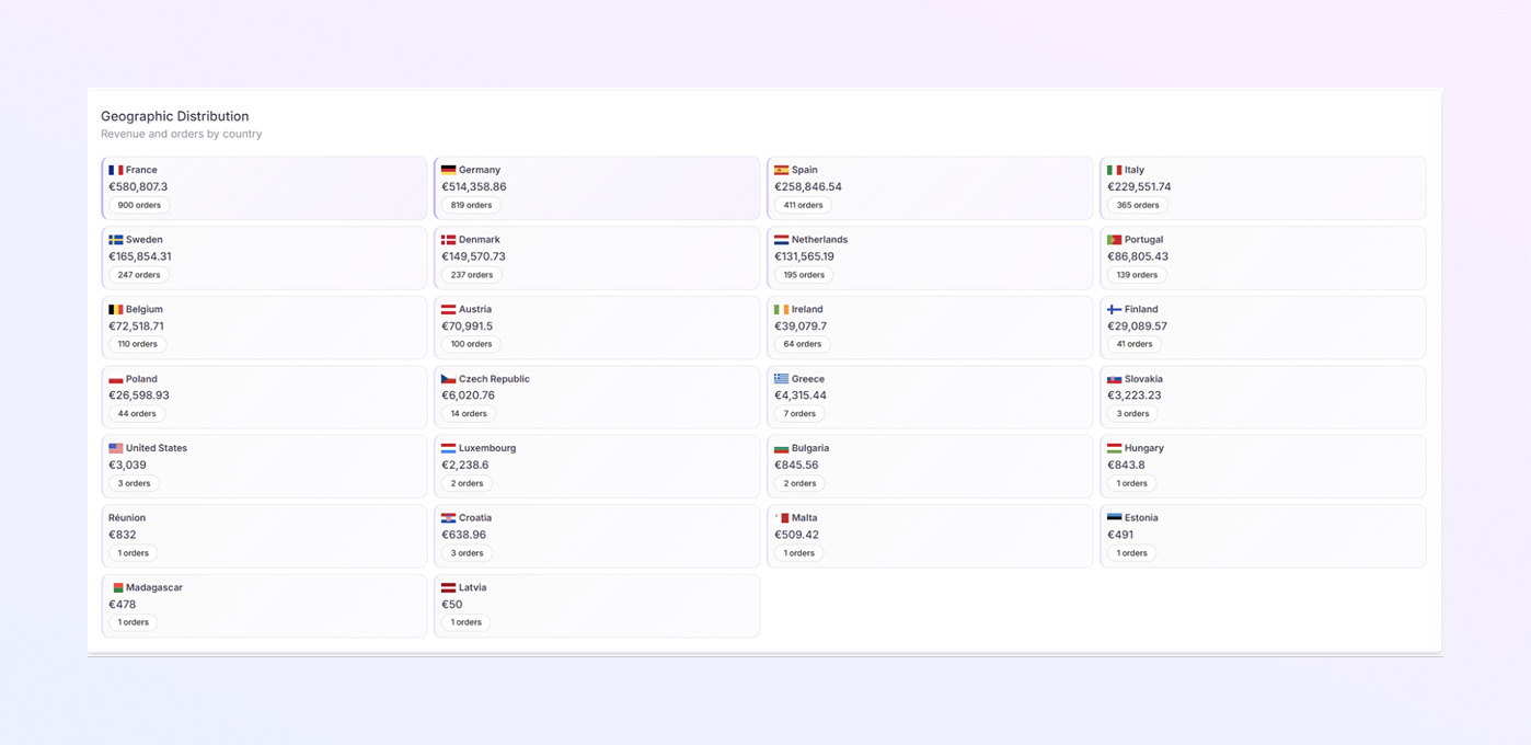
Geographic Distribution
-
This section displays revenue and order count by country in a card-style layout.
-
Each card represents one country.
-
For each country, the card shows:
-
Country name and flag
-
Total revenue (€) generated from that country
-
Number of orders from that country
-
How to Use This Section
-
Quickly identify top-performing countries
-
Compare revenue between countries
-
Spot countries with:
-
High revenue but low orders
-
High orders but lower revenue
-
This helps you understand customer value by region.
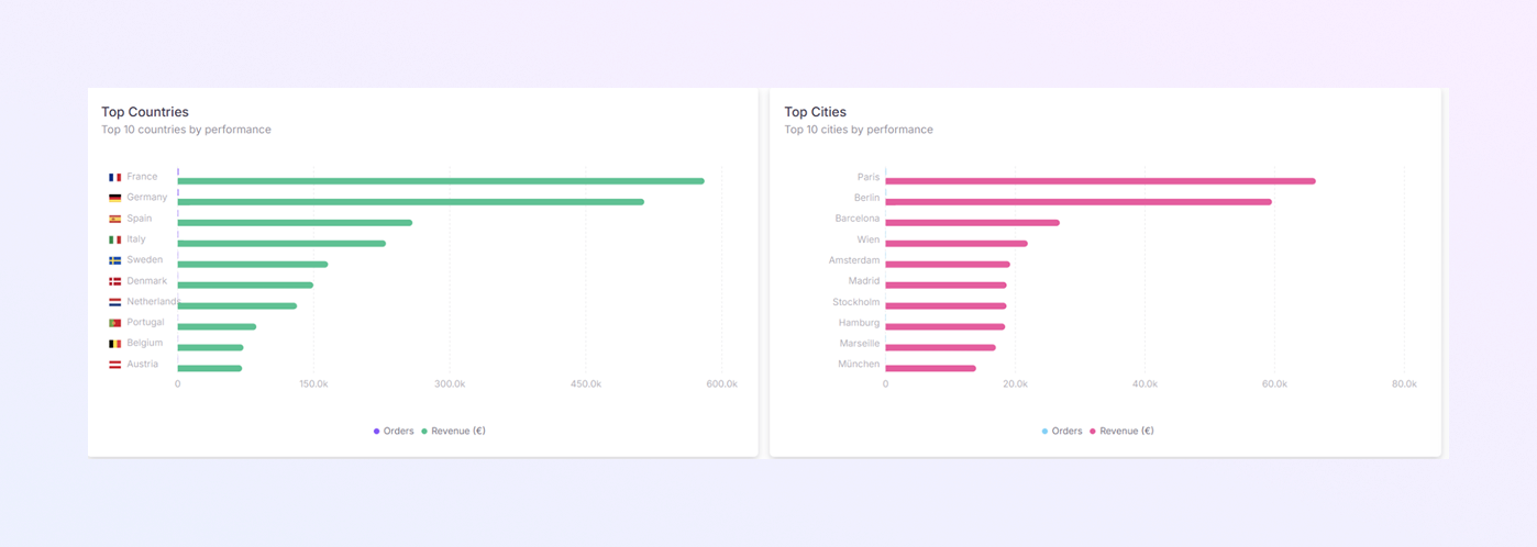
Top Countries by Performance
-
A horizontal bar chart displaying the top countries based on performance.
-
Each bar represents a country
-
Longer bars = higher performance
-
Countries are ranked from highest to lowest
-
Data Shown by Orders and Revenue. You can visually compare both values.
How to Use It
-
Identify your strongest markets
-
Compare nearby or similar countries
-
Decide where to:
-
Increase marketing
-
Expand operations
-
Improve delivery or support
-
Top Cities by Performance
-
A horizontal bar chart showing the top cities generating sales.
-
Each bar represents a city
-
Longer bars mean higher sales performance
-
Cities are ranked from highest to lowest
Why This Is Useful
-
Helps identify high-demand cities
-
Useful for:
-
Local promotions
-
Faster delivery planning
-
City-specific sales campaigns
-
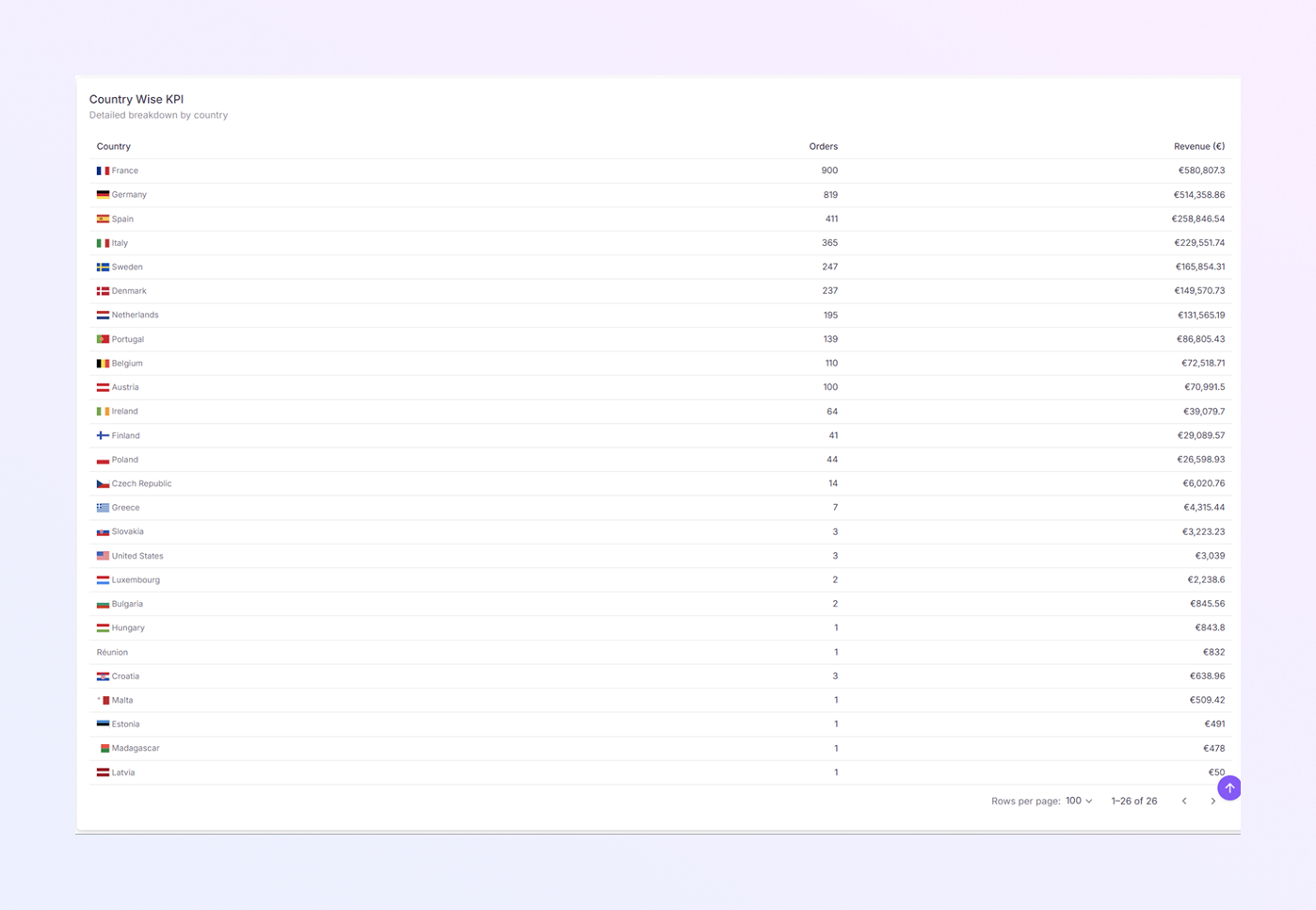
Country-Wise KPI Table
-
A detailed table listing sales performance for each country.
-
For each country, the table shows:
-
Country name
-
Number of orders
-
Total revenue (€)
-
-
Countries are usually listed in descending order of performance.
How to Use the Table
-
Get exact numbers (not just visuals)
Compare countries more precisely
Export or reference data for reports
Track small or emerging markets
Products Tab
The Products tab helps you understand which products and SKUs perform best. It shows top products by revenue, product condition performance, and detailed SKU-level sales data. This tab is useful for inventory planning, pricing decisions, and product strategy.
The Products tab is divided into four main sections:
-
Top Products
-
Condition Distribution
-
Condition Performance
-
Top SKUs Table
Each section focuses on a different level of product analysis.
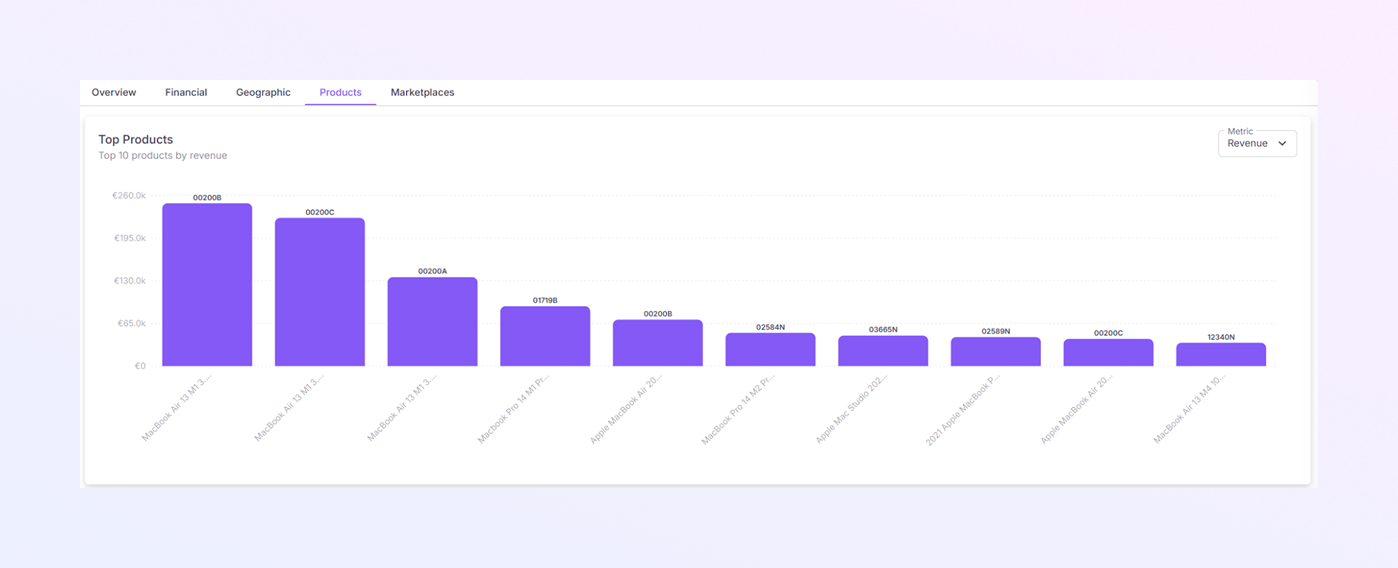
Top Products
-
This Vertical bar chart displays the top 10 products based on performance.
-
By default, products are ranked by Revenue. But you can change the metric from the dropdown and choose from revenue, orders, and quantity.
-
The chart updates automatically when the metric is changed.
-
Each bar represents one product.
-
Chart Details:
-
X-axis: Product names (example: MacBook Air, MacBook Pro, etc.)
-
Y-axis: Revenue amount (€)
-
Bar height: Higher bars mean higher revenue
-
How to Use It
-
Identify best-selling products
-
Compare product performance easily
-
Decide which products deserve:
-
More stock
-
Better pricing
-
More promotion
-
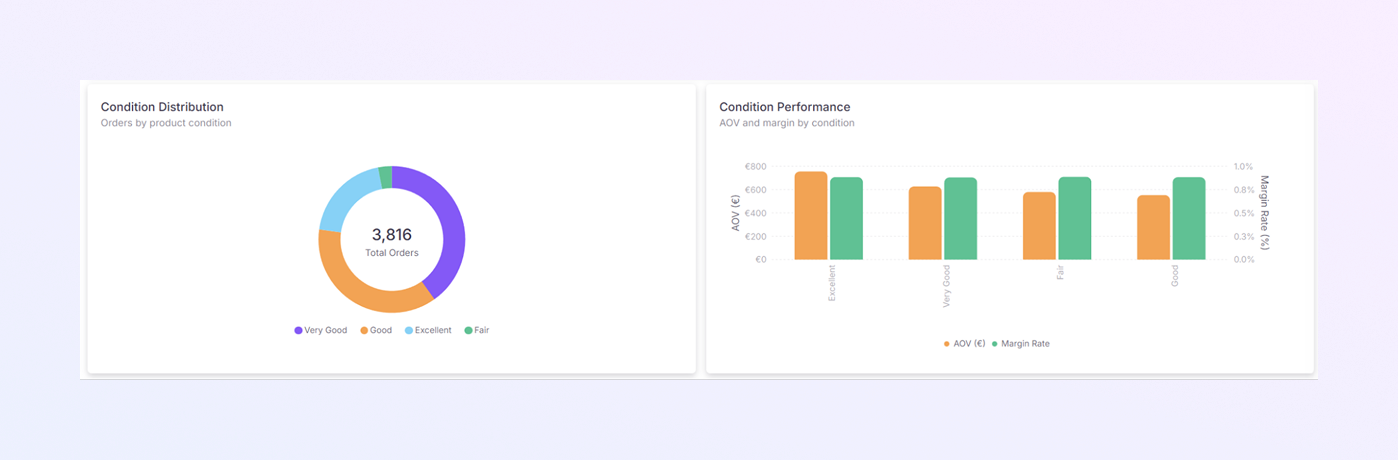
Condition Distribution
-
A donut chart that displays how orders are distributed by product condition.
-
Conditions Shown Examples may include:
-
Excellent
-
Very Good
-
Good
-
Fair
-
-
Each color represents a product condition.
-
The center of the chart shows the total order count.
How to Use It
-
Understand which product conditions sell the most.
-
Check customer preference for condition quality.
-
Adjust the sourcing strategy based on demand.
Condition Performance
-
This dual bar chart compares Average Order Value (AOV) and Margin Rate (%) by product condition.
-
Two bars per condition:
-
AOV (€): Average value per order
-
Margin Rate (%): Profit margin for that condition
-
-
Taller bars mean higher values.
How to Use It
-
Identify which conditions bring:
-
Higher order value
-
Better profit margins
-
-
Decide whether to:
-
Focus on premium conditions
-
Optimize margins on lower conditions
-
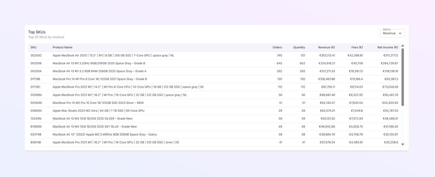
Top SKUs Table
-
A detailed table listing the top SKUs based on performance.
-
By default, SKUs are ranked by Revenue.
-
Each row represents one SKU, with the following details:
-
SKU: Unique product identifier
-
Product Name: Full product description
-
Orders: Number of orders for the SKU
-
Quantity: Units sold
-
Revenue (€): Total sales value
-
Fees (€): Marketplace or platform fees
-
Net Income (€): Revenue after fees
-
How to Use the Table
-
Track the exact performance of each SKU
-
Identify:
-
High-volume SKUs
-
High-margin SKUs
-
-
Support inventory restocking decisions
-
Detect underperforming products
Marketplaces Tab
This tab helps you compare how each sales marketplace is performing. It shows revenue, order value, trends, and key metrics for every connected marketplace. This tab is useful for deciding which marketplaces to focus on, optimize, or reduce investment in.
The Marketplaces tab is divided into four main sections:
-
Metrics Comparison
-
Revenue Share
-
Multi-Marketplace Trend
-
Marketplace KPIs Table
Each section helps you analyze marketplace performance from a different angle.
Metrics Comparison
-
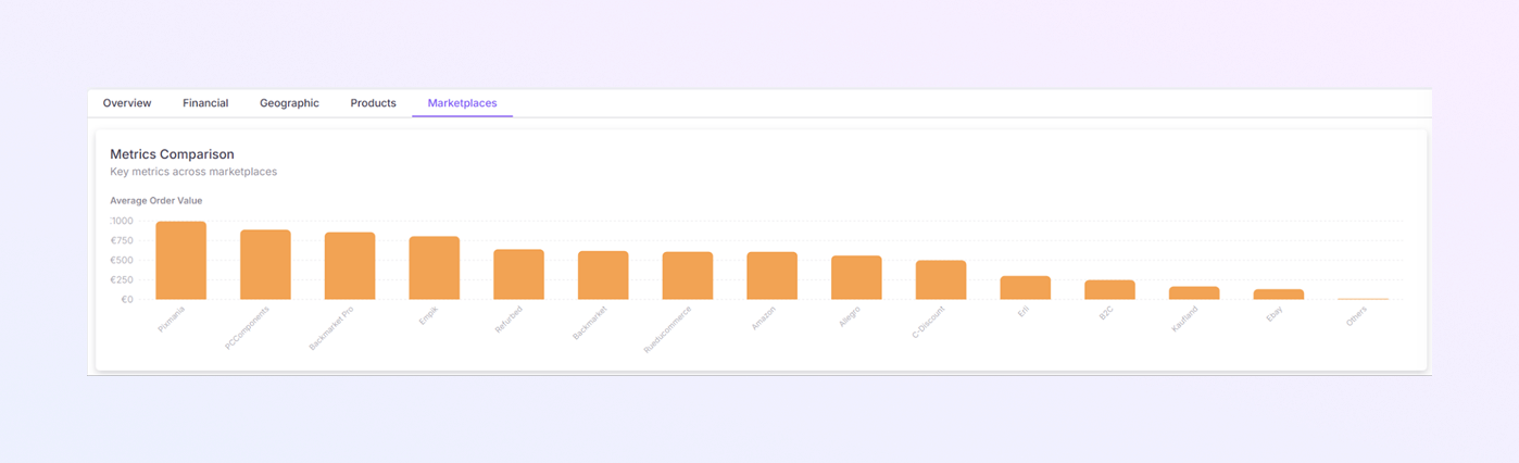
This Vertical bar chart compares key performance metrics across marketplaces.
-
By default, it shows Average Order Value (AOV) for each marketplace.
-
Each bar represents one marketplace
-
X-axis: Marketplace names (example: Backmarket, Amazon, Refurbed, etc.)
-
Y-axis: Metric value (such as AOV in €)
-
-
Taller bars mean better performance for that metric
How to Use It
-
Compare marketplaces at a glance
-
Identify marketplaces with:
-
Higher order value
-
Lower customer spending
-
-
Use this insight for pricing and promotion planning
Revenue Share
-
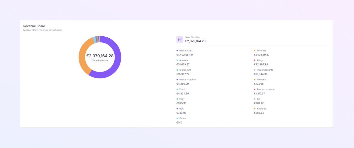
This Donut chart shows how total revenue is distributed across marketplaces.
-
Each color represents one marketplace
-
The center of the chart shows Total Revenue (€) for the selected period.
-
For each marketplace, you can see the Marketplace name and the Revenue amount (€).
How to Use It
-
Identify top revenue-generating marketplaces
-
See which platforms contribute less to total revenue
-
Balance sales efforts across marketplaces
Multi-Marketplace Trend
-
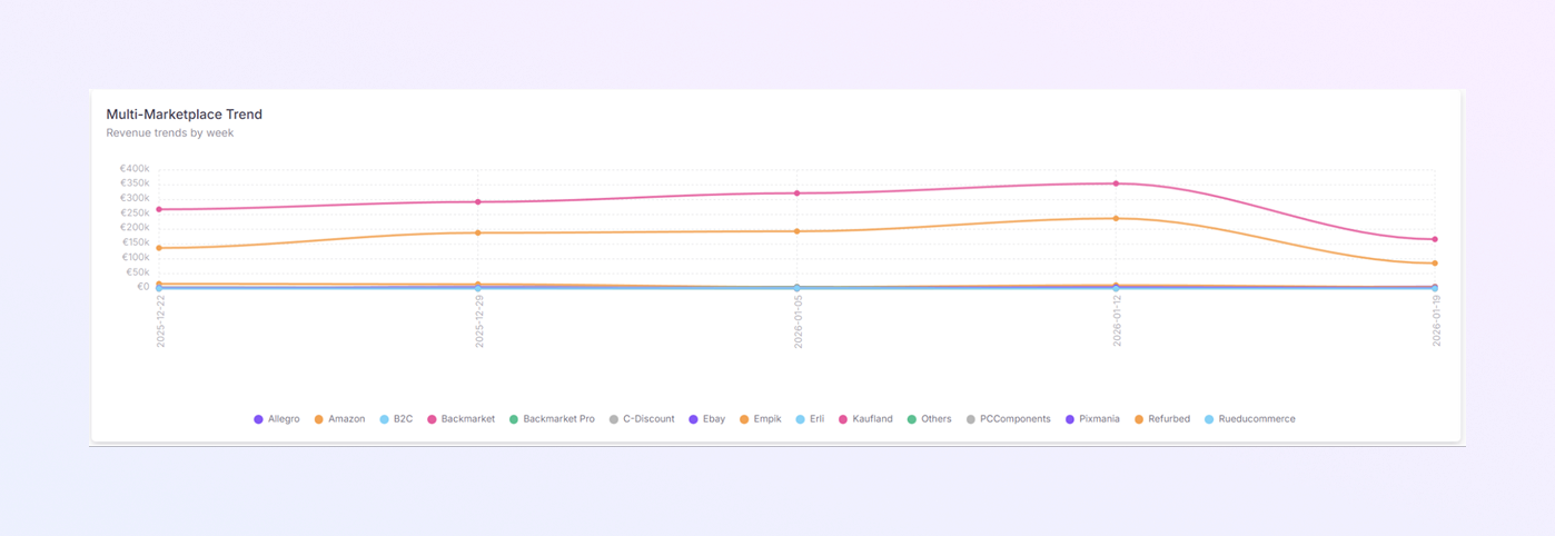
A Multi-line chart that tracks revenue trends over time for multiple marketplaces.
-
Each line represents one marketplace.
-
X-axis: Time (day, week, or month)
-
Y-axis: Revenue (€)
-
-
Rising lines mean growth, and Falling lines mean decline.
-
Each color corresponds to a marketplace.
-
You can visually follow each marketplace’s trend.
How to Use It
-
Track performance changes over time
-
Compare growth rates between marketplaces
-
Spot:
-
Consistent performers
-
Sudden drops or spikes
-
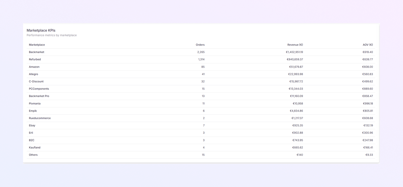
Marketplace KPIs Table
-
A detailed table with key performance indicators (KPIs) for each marketplace.
-
Each row represents one marketplace, showing:
-
Marketplace Name
-
Orders: Total number of orders
-
Revenue (€): Total sales value
-
AOV (€): Average Order Value
-
How to Use It
-
Get exact numbers behind the charts
-
Compare marketplaces in detail
-
Identify:
-
High-volume marketplaces
-
High-value marketplaces
-
-
Support strategic decisions with data
Summary
The ExactFlow Sales Dashboard gives you a clear, visual overview of:
-
Revenue
-
Orders
-
Marketplace performance
-
Order status
-
Sales trends over time
By regularly reviewing this dashboard, you can make better decisions, improve sales performance, and manage your marketplaces more effectively.